Love Agency Lithuania · 2019–2020
Alternative Cycling Calendar
A calendar of cycling events in Lithuania, each ride with its own route, its own local story and its own look. At Love Agency I designed the identity for all three: Baika Tour, Most Epic Gravel Ride Ever and Slibinai. Each got its own logo, colours, type and illustration.
- Role
- Visual Identity, Illustration, Art Direction
- Year
- 2019–2020
Part 01
Baika Tour
The brief
Objective
Brand a summer ride that ends in a party on the final day, with a character that could carry it for years.
Solution
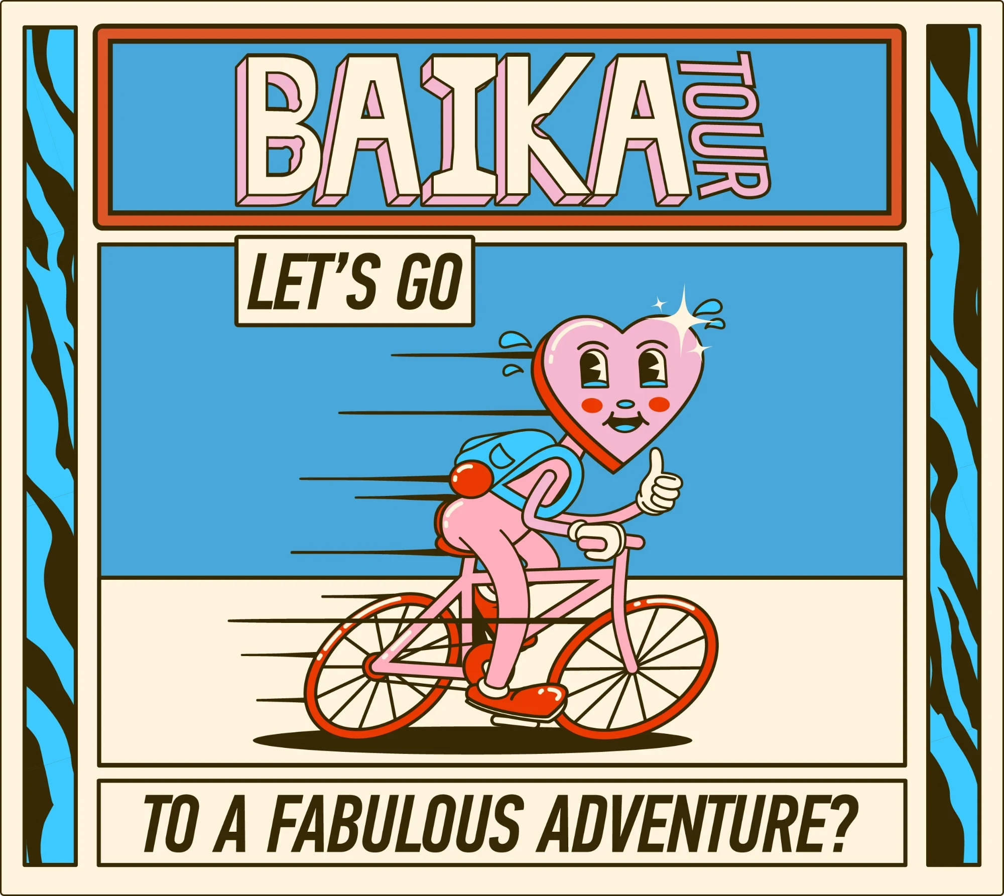
Playful cartoon visuals, bold colour and busy supporting textures, led by a heart on a bike.
Colour
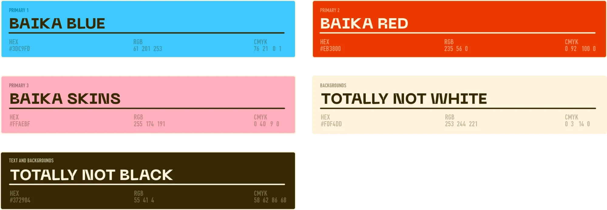
Baika Blue and Baika Red carry the energy, and Baika Skins, a soft pink, keeps it warm. Totally Not White and Totally Not Black do the backgrounds and the text.
Type
Neue Machina for titles and headings, PF DIN Pro for text.

Logos and textures
The Baika Tour logo in four versions: in colour, framed on blue, and in black and white both ways round. Two textures back it up, a zebra stripe and a sprinkle pattern, each in the brand colours.


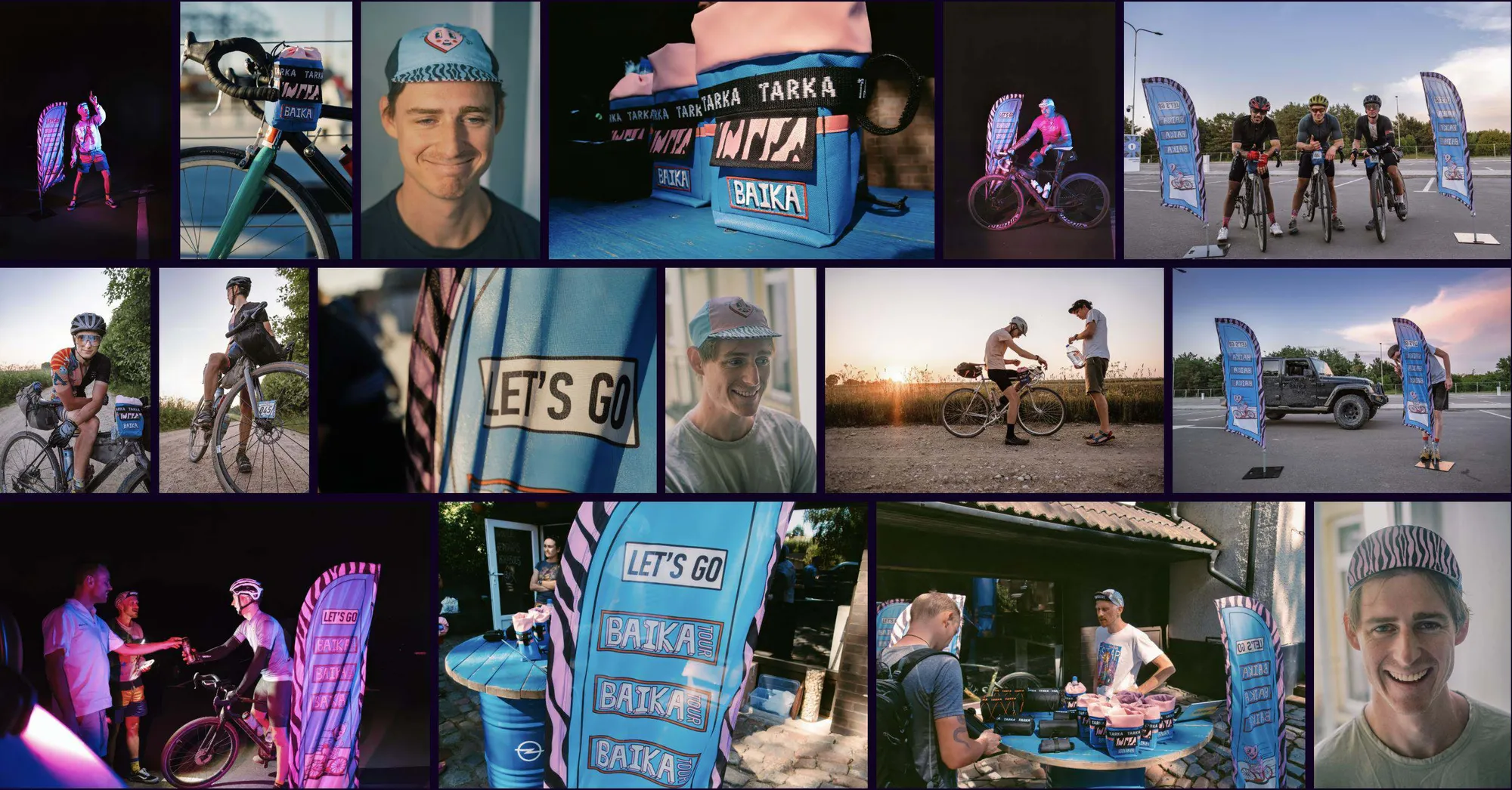
At the event
Part 02
Most Epic Gravel Ride Ever
The brief
Objective
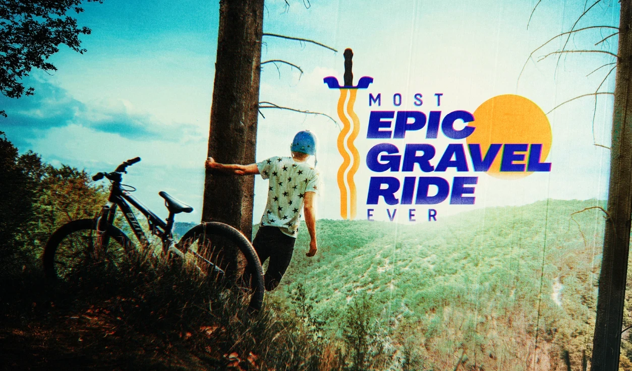
Brand a gravel ride across Lithuanian roads, centred on Zarasai and tied to the town's own heritage.
Solution
The sword from the Zarasai coat of arms, curves that stand in for the roads riders will meet, bold colour and strong type.
Colour
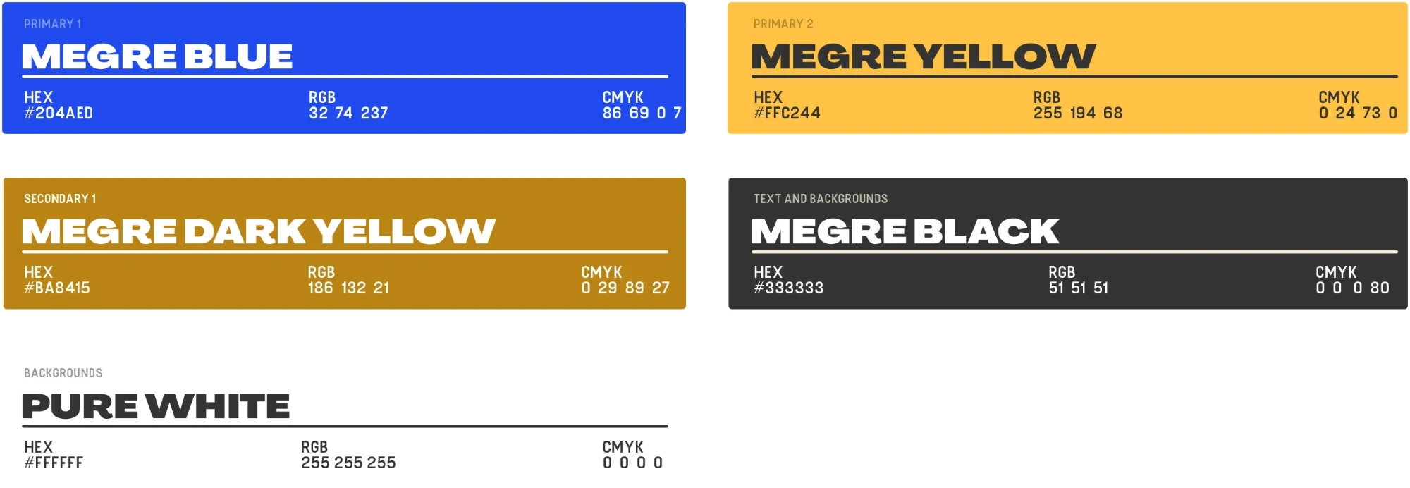
Megre Blue leads. Megre Yellow and Megre Dark Yellow bring the contrast. Megre Black is for text and Pure White for backgrounds.
Type
Agrandir Wide Black for titles and headings, Fuji Light for text.

Logos and badges
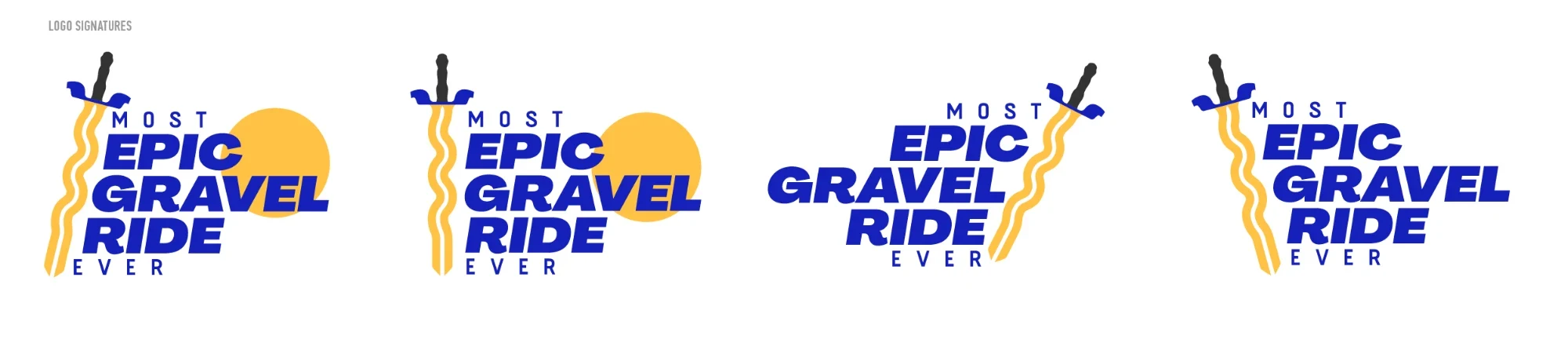
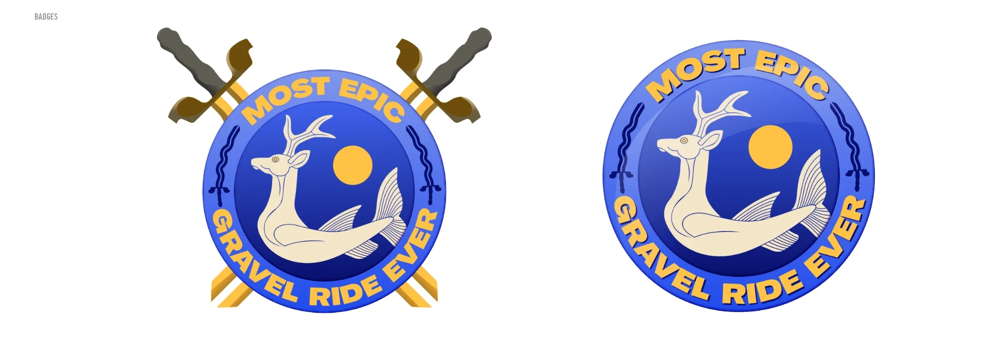
Four versions of the logo: the sword, the sun and the name, rearranged to fit. Two round badges, one with crossed swords, carry a deer with a fish's tail.
At the event
Part 03
Slibinai
The brief
Objective
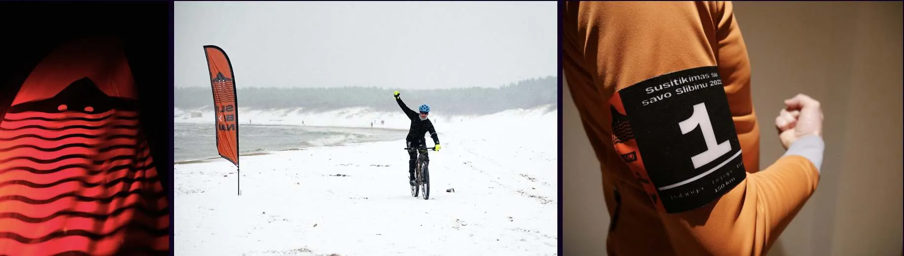
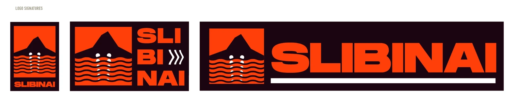
Brand the hardest ride on the calendar, in extreme conditions on the coast, with a logo that recalls the stone cave with glowing eyes from traditional Lithuanian painting.
Solution
High contrast and borrowings from surf brands, so it looks as tough as the ride is.
Colour
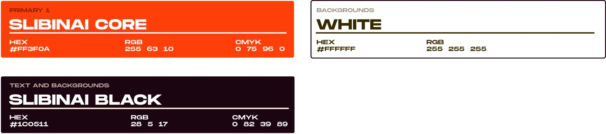
Three colours only: Slibinai Core, a hot red-orange, with White and Slibinai Black.
Type
Monument Extended, Bold for titles and headings and Light for text.

Logos and posters
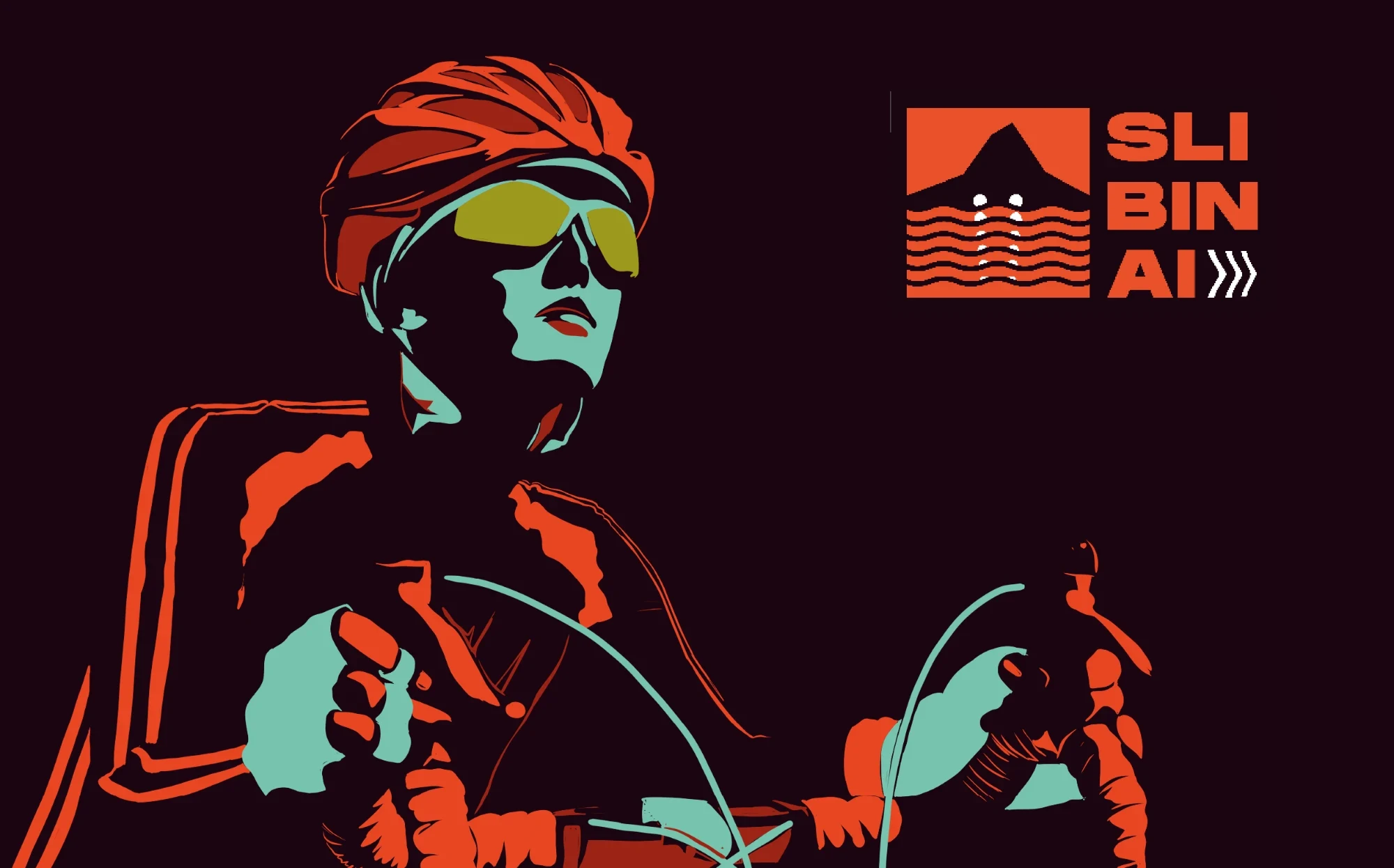
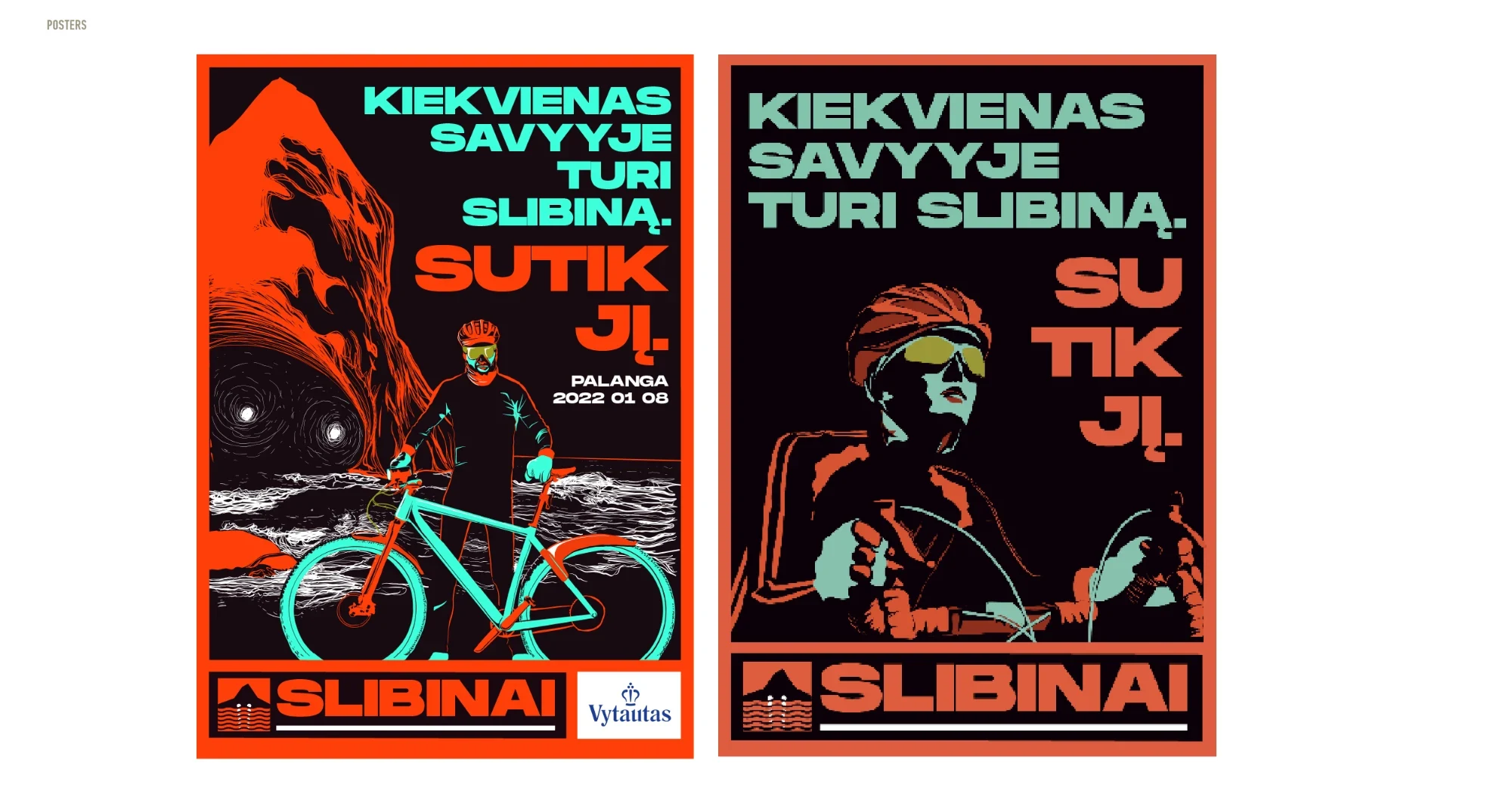
The logo stacked, square and in one line. The posters say "Kiekvienas savyje turi slibiną. Sutik jį.": everyone has a dragon inside. Meet it. Palanga, 8 January 2022.
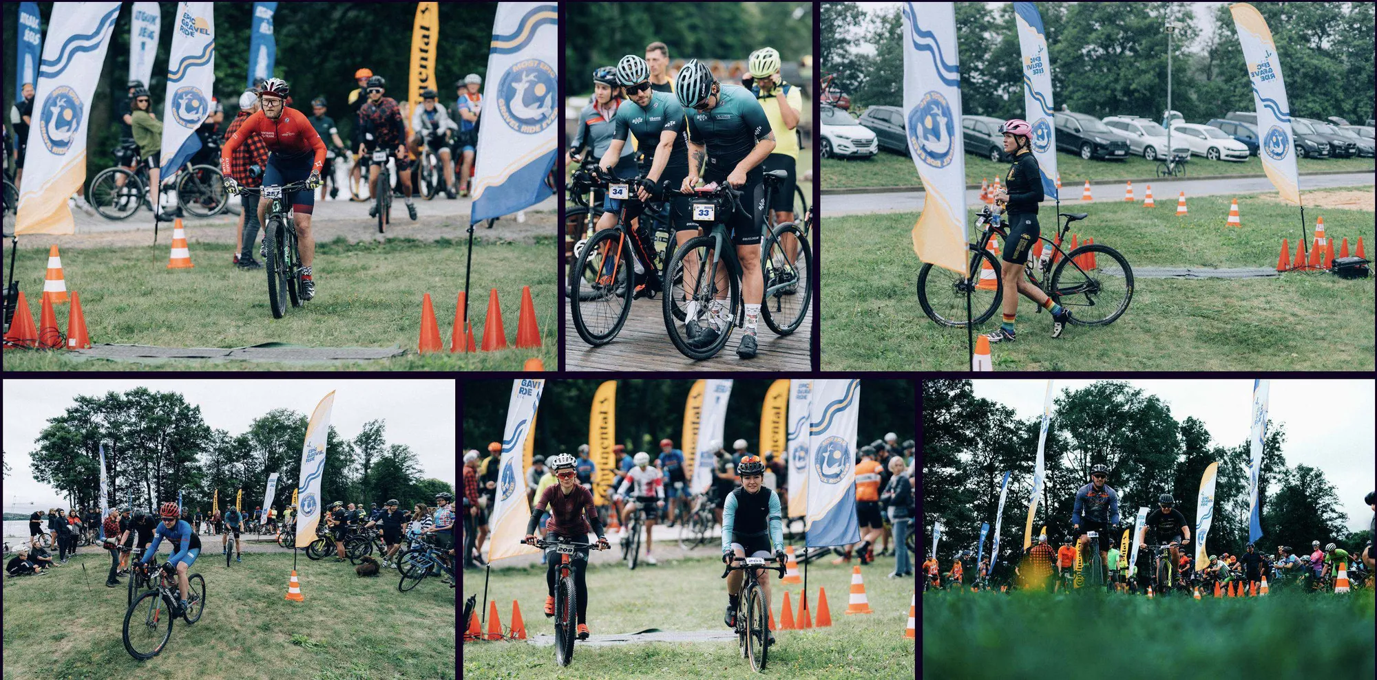
At the event